REACH is a leading humanitarian initiative providing granular data, timely information and in-depth analysis from contexts of crisis, disaster and displacement. The work of REACH directly feeds into aid response and decision-making by providing accessible and precise information on the humanitarian situation of crisis-affected populations.
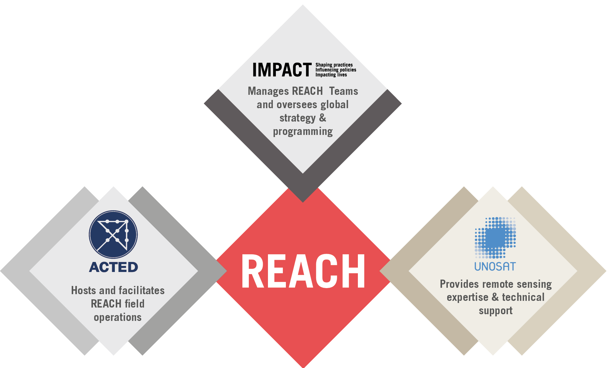
Created in 2010, REACH is a joint initiative of IMPACT Initiatives, ACTED and the United Nations Operational Satellite Applications Programme (UNOSAT). REACH activities are conducted in support and within the framework of inter-agency coordination mechanisms at field and global levels to enabling more efficient aid planning and response.
OUR MISSION
Humanitarian actors effectively respond to the needs of crisis-affected communities.
OUR VISION
To strengthen evidence based decision-making by humanitarian actors through efficient data collection, management and analysis in contexts of crisis.
REACH’s teams consist of 400 assessment, data analysis, geographic information system and field coordination experts, based across the 20+ countries we work in. Furthermore, our large-scale assessments made possible by the contribution of over 800 short-term staff that join REACH on a yearly basis to support with data collection and field implementation.
The global programme team of REACH is hosted by IMPACT Initiatives in Geneva, which provides strategic oversight and technical support for country teams. In addition to our presence in protracted crisis, REACH regularly deploys to sudden onset humanitarian crises, supporting evidence-based aid planning and delivery from the very beginning of new emergencies.
Thanks to the relevance and success in our work, we are always looking for talented and driven new team members to join us in our field offices and in our Geneva HQ.


